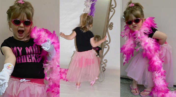
SPLAIN THAT to the kidlet. Doesn't always come across so well. She is of the thinking she is 25 years old and my scrapbook room is her play room to roam free. (cue music)
HEY I WOULD HAVE LOVED to have been able to play in my moms studio growing up but that was a HUGEEEEE no no. I wasn't even allowed to touch one paint brush or look at a bottle of paint. IF I so much as LOOKED at it My eyes would burn out my skull. This kid has no clue how lucky she is to have me for a mom! I let her play in so much of this stuff give her so much scrap stuff and let her create and play aimlessly on half of my 6 foot by 6 foot scrap island. ya how many kids get to do this?
She has her own area and a good many supplies.
I say all of that to say this. I have had my layout that I was working on set out on my scrap table (I had been down with shingles and had been working on it before it got really bad) well I guess the temptation was just too much? she couldn't help herself? She was just helping?
She glued parts of my title down. ughhhh I tried to pull it up but it ripped the cardstock. so I just tried to go with it best I could. ANYWAY. This page is kinda funky now. IM not real happy with it. I guess I will now always remember that though I will have to find some kinda better lock to put on my scrap room. sigh...

This is with the Petal Pushers kit for Scrapbook Obsessions. www.scrapbookobsessions.com
Techniques and not included in the kit:
I used the Tim Holtz texture fades the college/notebooks set I sprayed glimmer mist on it before I ran it through. Then I inked it to show the dimension I love the numbers on that (kinda goes with the text message of the layout I thought)
I used the graphically speaking cricut cartridge to cut the arrow and outlined it with a white pen. The brads that I had didn't match so I used pink stickles to make them all sparkly.
I used Plantin School Book font on the cricut to cut the title, and pink stickles to decorate the title. I accented the chipboard with Prima e pearl bling.
I used several different white pens trying to get one to work... long story but a great tip from my friend lynn (HI LYNN) was to put them in the fridge and let them chill and they would roll smoother after that. sure enough. it did work a lil better.
All edges were inked with colorbox fluid ink chalks
I made a flower out of the ribbon in the kit and used the flower as an accent piece on top. I pop dotted them with foam stickies to make them pop off the page.
I used pop dots on the large photo and on the arrow to make it stand up off the page also kinda makes it stand out more.
There are 7 buttons (representing she is 7 years old)
It is REALLLY cloudy so this photo didn't turn out so hot. gonna try it again in a bit.

2 comments:
Hahaha! You're too funny! :)
Cute page!
Omgosh, too funny. Sorry Nancy - I know she just was trying to help out dear Mommy. :) Gotta love it. I think the layout still turned out nicely. Hugs. Hope your shingles go away and soon!
Post a Comment