Something RED:

Something Loud: Oh I could have done SOOO MUCH for this one but I but my Nemesis:

Fork:

I used the literal as it was in Mexican Lasagna!!
A sign: Disclaimer (I just took a group of these signs I am not promoting or NOT not promoting any of these said candidates on these signs, it is just a photo at the election place of a bunch of signs I didn't even notice the names on them before I took the photo. It is just for the photo of the day spirit of photography so if you have to complain about it, THEN, call ya mama cause I do not wanna hear it Thank you!) AND YES I voted! :)
 | ||||
| ALL the campaign signs there were tonsss of them. |

 | |||||||||
SO now I am all caught back up. I got my kit from Paper Posies. Thought I would catch up on some of my scrapbooking. These are some pictures from a while back but they always make me laugh. Using pastels when I scrapbook is always a difficult task. I know I have heard a lot of others say the same thing. So I tried very hard to not say forget it and just add other stuff. I stuck with the kit. The only thing I added extra is the chipboard letters the tiny letter stickers some inks staples that's about it. EVERYTHING else is from THIS MONTHS Paper Posies kit. So see. It is easy to make it work.
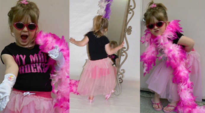
Even though her shirt is not pastel colors It blended with the other colors. (the backgrounds.) just pick up one color (the yellow) then the brown then play off the pink I usually try for 3 colors from t he photo to blend this one was the pink the yellow the brown to high light. As you see it wasn't the exact shade as in the photo but it was enough to blend and make it work. Pastel tone papers along with Brights in photos will create BALANCE on your layout. just a tip for you.

You can click on the layout to see it larger. The journaling reads: I am sure the staff at Old Navy cringe when they see us walk in. You absolutely LOVE the "people" at the front. You will not leave them alone. You talk to them as if they are real. The little girl and the dog are your favorites. ~2011
I added ruffles to the circle and the edge of the paper by tearing off strips then spraying water on it (after I inked the edges) crinkling it up then gathering it up under the edges in layers. I know it kinda looks like a mess. It looks better in real life. Hard to see in the Photo. The butterfly is not as dark now either that is a wooden butterfly so the ink has absorbed into it. It is sooo pretty. Is more of a mauve brown color and the edges are darker. Hard to get the true photo of it. But I think you get the idea.
1 comment:
Such a lovely LO !
Post a Comment